Every hybrid office runs on a steady stream of bookings, and it is tempting to read that stream as a record of how the space gets used. But that doesn't work.
A reservation tells you someone meant to come in, not that they sat down, or who dropped in without booking. So when finance asks how much office space the business really needs, you can't tell from the booking report.
Workplace analytics software turns those raw signals into an answer. It takes the bookings, check-ins, badge swipes, WiFi connections, and sensor readings a building already produces and shows how the space is used, so you can right-size the footprint, plan the week, and hand leadership a number that holds up.
This article evaluates eight hybrid workplace analytics solutions based on data quality, deployment effort, reporting, pricing, and planning capabilities.
8 workplace analytics software compared at a glance
| Tool | Data model | Deployment effort | What it measures | Best for | Starting price |
| Awaio | Booking, hardware-free | Software only; data flows from the first bookings, sensors optional | Planned attendance, booking and check-in utilisation, per-locker opening data | Hardware-free, forward-looking for enterprises planning across desks, rooms, lockers, and parking | Per resource, unlimited users; desks from €69/mo |
| Ronspot | Booking | Software only; vendor says most teams are live within a few weeks | Desk, room, and parking utilisation, attendance trends, no-show reporting | Booking analytics inside Microsoft Teams and Outlook | Per space; free trial; quote |
| Envoy | Booking, plus access to data via integrations | Software for booking; presence-based occupancy needs badge or WiFi integrations | Desk, room, and parking usage, occupancy by location, visitor traffic | Visitor-heavy workplaces that want attendance and space data together | Platform fee plus per resource; quote |
| OfficeSpace | Multi-source (WiFi, badge, booking, sensors) | Software plus WiFi, badge, and sensor integrations; advanced planning often needs vendor support | Occupancy, heatmaps, cost per seat, real estate forecasting | Enterprise space planning and real estate reporting | Custom per employee; quote; no free trial |
| Maptician | Booking plus presence (calendar, IP, check-in) | Software only; one law-firm office went live in three weeks | Seat and room utilisation, cost per seat, presence by team and location | Professional-services firms needing presence tracking | Per active user; quote-based; trials offered |
| Gable | Multi-source (booking, badge, WiFi, HRIS) | Software plus access-control, HRIS, and calendar integrations | Utilisation by neighbourhood, peak hours, no-show rates, cost per seat | Distributed teams unifying booking and passive data in one view | Custom pricing (Enterprise tier) |
| VergeSense | Sensor, plus WiFi and booking | Sensor installs average under 90 days; WiFi-only setup under a week | Active and passive occupancy of the desk, people count, portfolio trends | Precise passive occupancy when hardware is funded | Hardware plus subscription; quote |
| Density | Sensor (radar) | Sensor hardware per space; Waffle units are self-installed | Anonymous real-time people count, occupancy by space and floor | Privacy-sensitive, enterprise-grade people counting | Waffle sensor $229/unit plus software from $2.50/desk/mo |
1. Awaio: Best for hardware-free, forward-looking analytics for enterprise teams
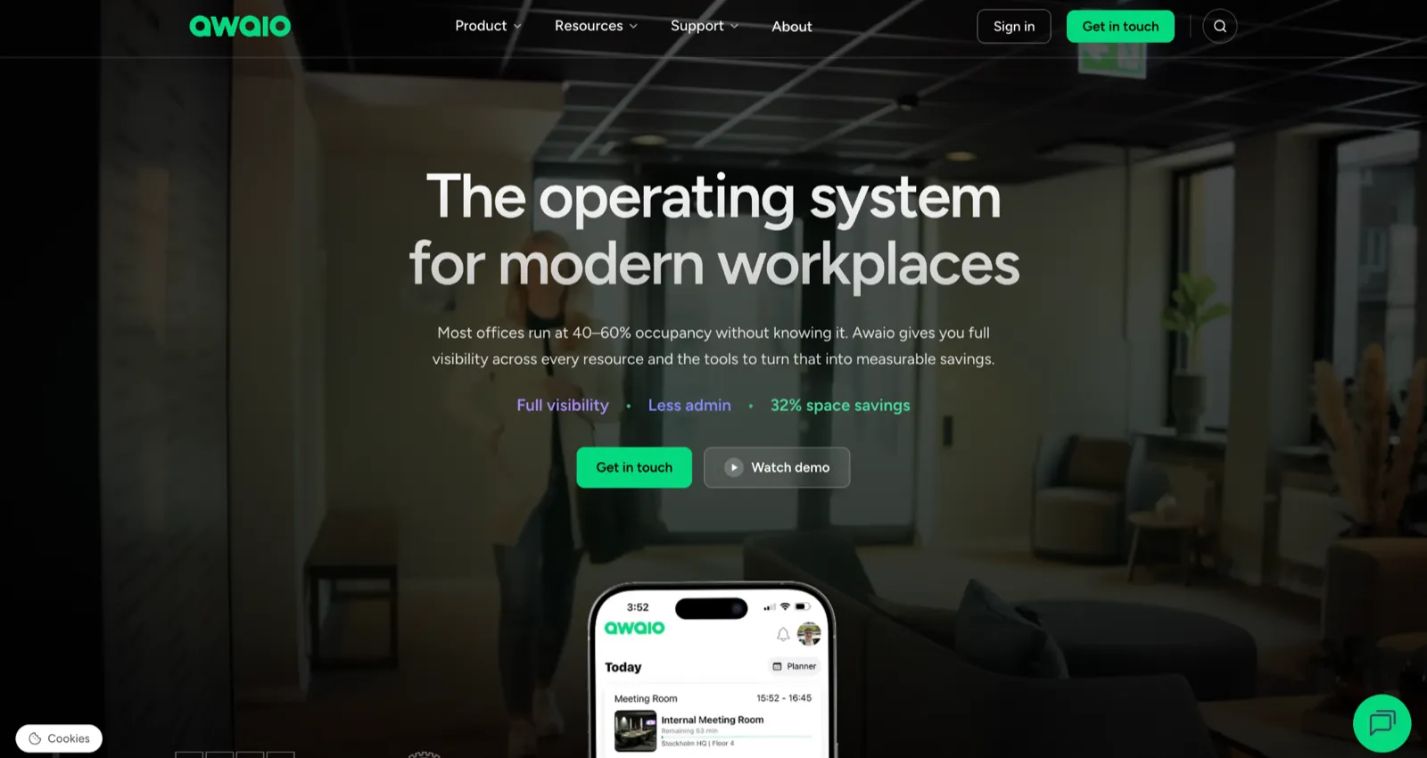
If your biggest challenge is understanding how employees use the office so you can make smarter space planning decisions, Awaio is ideal for the job. It turns booking, check-in, and access data into workplace analytics that help facilities teams forecast attendance, identify underused resources, and optimise hybrid workplaces without requiring a large sensor deployment.
Because it analyses planned workplace behaviour rather than only physical occupancy, Awaio helps organisations prepare for what's coming next.
Linking every booking to a person, rather than an anonymous occupancy count, helps both sides of the workplace. Employees can see who is coming in and coordinate their office days, while facilities teams get the richer context that turns space planning into a decision rather than a guess.
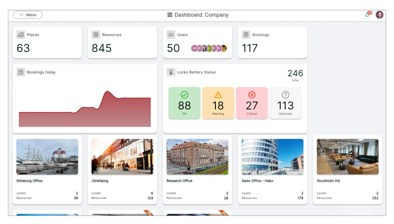
Booking-based analytics don't capture unplanned workspace usage or no-shows unless employees check in. Organisations that need passive occupancy measurement can combine Awaio with existing sensors, giving them both behavioural context and physical occupancy data.
Key features
- Plan-ahead view: see which desks, rooms, and colleagues are booked for an upcoming day, not only the present moment.
- Utilisation dashboards: track occupancy rates, peak usage times, the most and least used resources, and usage by team or individual from the admin dashboard, without a separate analytics tool.
- Per-resource opening data: read usage down to the individual locker, so idle delivery or e-bike lockers stand out against near-full personal ones.
- Booking confirmation with auto-release: free a reserved desk or room when no one confirms in the set window, which keeps the utilisation figures clean.
- Sensor-agnostic ingest: pull occupancy from devices a building already runs instead of installing new ones.
Pros
- Booking and check-in data are available directly in the admin portal.
- Shows how desks, rooms, lockers, and parking are used, so you can add or remove resources with evidence.
- Puts planned attendance next to past use, helping you decide which days need more or fewer seats.
- Connects locker and access activity to teams, making recurring bottlenecks easy to spot and fix.
Cons
- Relies on people booking and checking in; weak compliance makes attendance data less reliable.
- No sensors, so you see use patterns, not exact headcounts in each area.
- Detailed cost or forecast models still have to be built in Excel or other analytics tools.
Pricing
Awaio's pricing is modular and billed per resource, not per person. The reporting is part of each resource rather than a separate analytics fee, so every module below already includes its analytics.
- Desk management: €69/month for up to 20 desks, then €4.9/desk/month
- Room booking: €10.9/month
- Smart parking: €69/month for up to 20 spaces, then €4.9/space/month
- Office map: from €190, one-time cost per floor
- QR signs (optional): €39/sign
Desk management reports desk utilisation, and adding rooms, parking, or lockers brings each into the same dashboards and trend reports. Users are unlimited on every module, so your cost follows the resources you measure, not the size of your team.
How companies right-size using booking data
Awaio's value starts the moment bookings begin producing data. At OneSubsea in Bergen, moving lockers to self-service booking gave the facilities team 100% usage visibility, so they can see which cabinets are in use and which sit idle, instead of guessing.
Norwegian Property at Aker Brygge and Sweco in Oslo run the same play across shared wardrobes, reading the opening data to right-size a fleet on evidence rather than adding storage on assumption.
See what your booking data already knows about your office. Book your Awaio demo.
2. Ronspot: Best for booking analytics inside Microsoft Teams and Outlook
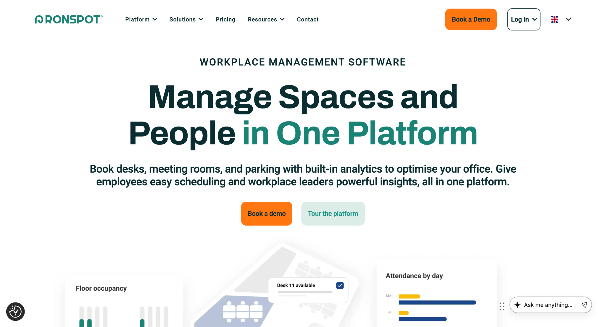
Ronspot suits the Microsoft-centric office that wants usage data without asking anyone to open another app. Its admin panel turns everyday desk, parking, and room bookings into reporting on utilisation, attendance trends, and unused reservations, so a facilities team can see which spots get held and never used, then tighten the rules around them.
Staff book from an interactive floor plan or straight inside Teams up to 90 days ahead, and a points-based credit system keeps oversubscribed parking fair. Like any booking-led tool, its analytics describe the space that was reserved and used rather than forecasting the week ahead.
Key features
- Usage and attendance reporting: track how desks, rooms, and parking are used and how attendance trends over time, from the admin panel.
- Unused booking report: flag reservations that were held and never used so admins can tighten the rules.
- Three-in-one booking: the desk, parking, and room reservations that feed those reports, bookable up to 90 days out.
- Teams-native with SSO: book and read reports inside Microsoft Teams, with Entra ID, Okta, or Google sign-in and ISO 27001 certification.
Pros
- Converts desk, room, and parking bookings into clear utilization views for right-sizing space.
- Surfaces no-shows and attendance trends, so you can tune hybrid rules based on behaviour.
- Simple reports that HR, facilities, and managers can read without a data background.
Cons
- Walk-ins and informal seat swaps may not show up, especially in casual booking cultures.
- Limited support for deep cost or portfolio analytics; best for operational utilization.
- Does not unify sensor, WiFi, or badge feeds; multi-source analysis must happen elsewhere.
Pricing
Ronspot does not publish pricing publicly. They offer a custom quote, billed annually based on the number of spaces you book. A 7-day free trial is available.
3. Envoy: Best for visitor-heavy offices that want space data alongside the front desk
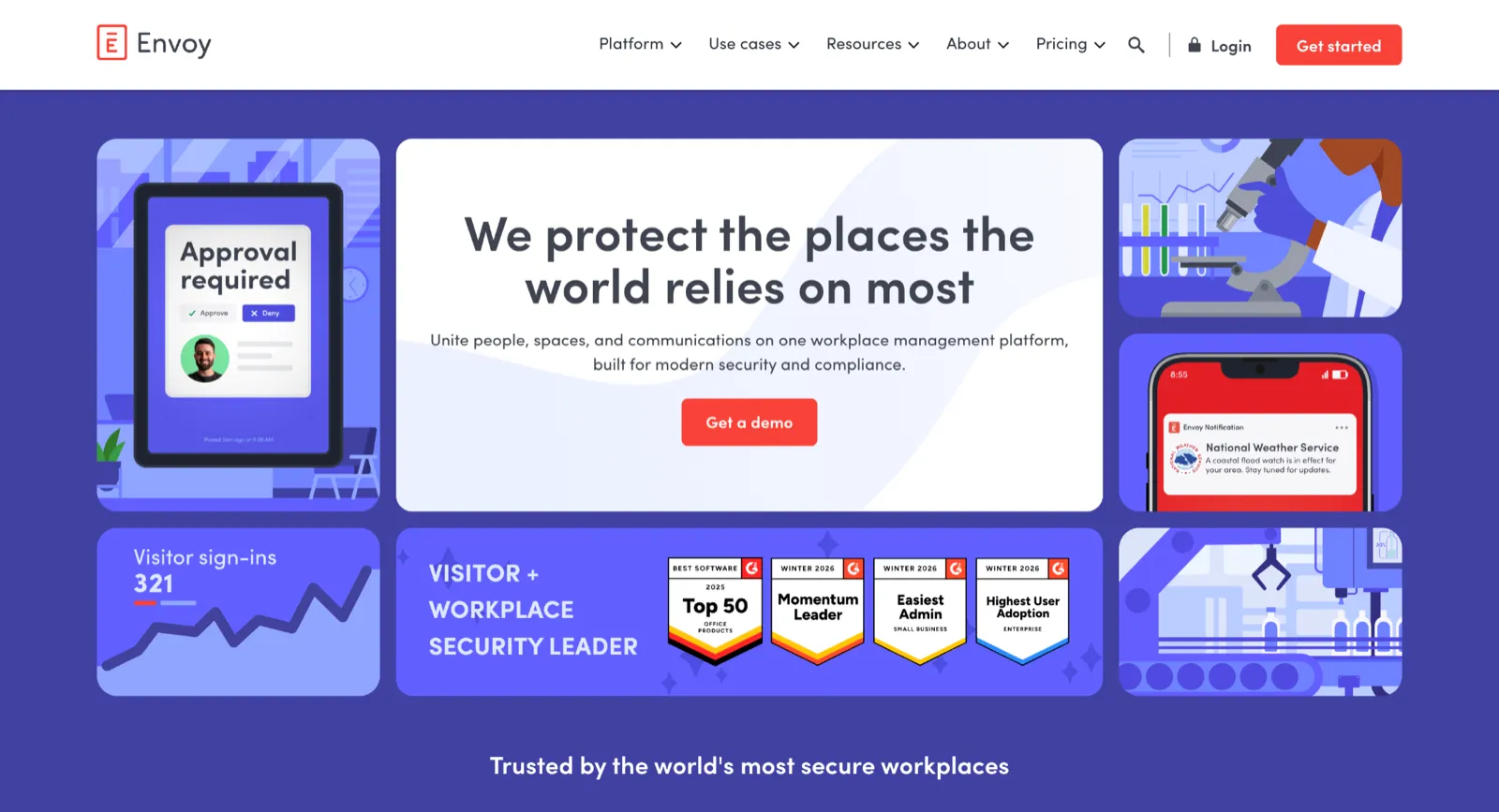
Envoy belongs on an analytics list for the space data that rides alongside its visitor management, the product it is best known for. Pre-built Desks, Rooms, and Parking dashboards report how each resource type is used and how occupancy moves across locations, and a room right-sizing prompt steers organisers toward spaces that fit the group.
Desk, room, and parking booking sit on the same platform as the visitor tools, so a reception-heavy or compliance-driven office can run people data and space data from one admin dashboard.
Key features
- Resource dashboards: track how desks, rooms, and parking are used, and how occupancy shifts across locations, from analytics that ship with the platform.
- Presence-based occupancy: on the Enterprise tier, badge and WiFi sign-in turn attendance into occupancy trends that go beyond bookings.
- Reservations module: the desk, room, and parking bookings that feed those dashboards, with auto-release for missed check-ins.
- Visitor management: sign-in, badge printing, and host notifications, Envoy's strongest suit and a source of front-desk traffic data.
Pros
- Combines access scans, WiFi, and app sign-ins into one occupancy view, reducing manual data stitching.
- Breaks down desk, room, and visitor use by day, time, and group for peak-time planning.
- Keeps attendance data close to visitor and security workflows, useful for safety-conscious sites.
Cons
- Complex portfolios and custom metrics usually need re-modeling in other analytics tools.
- Space planning sits on top of a visitor-centric product, which can limit CRE-style workflows.
- Desk and room booking rides on a visitor-first platform, so an office that leads with the desk floor can pay more than it would on a dedicated booking tool. If that sounds like you, these Envoy alternatives are worth a look before you commit.
Pricing
Booking desks, rooms, and parking is listed at $5 per bookable resource per month, but that excludes a separate platform fee Envoy won't quote publicly, and the platform is where the analytics sit.
Its Premium tier goes for $362 per location/month, billed annually and includes basic dashboards. The advanced and presence-based analytics are on the Enterprise plan and priced in custom quotes.
4. OfficeSpace: Best for enterprise space planning and real estate reporting
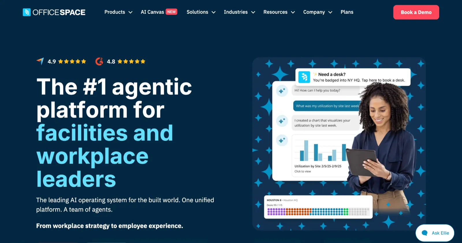
OfficeSpace is built for the facilities or real estate team that treats space as a portfolio to be planned rather than a set of desks to be booked. Its analytics blend presence data from WiFi, badges, desk booking, and third-party sensors into one utilisation view, with occupancy heatmaps, cost-per-seat reporting, and real estate forecasting, and an Insights AI agent answers utilisation questions in plain language. Move management and scenario planning let a team model a restack on the floor plan before committing to it, which is the depth that separates OfficeSpace from a lighter booking tool.
Key features
- Multi-source occupancy: combine WiFi, badge, booking, and sensor inputs into a single utilisation picture.
- Heatmaps and cost analysis: see the most- and least-used spaces and tie usage to real estate cost per seat.
- Real estate forecasting: project future space needs against hiring and growth.
- Move and scenario planning: model seating and department layouts on the floor plan before a change lands.
Pros
- Aligns presence, bookings, and sensors in one occupancy view you can use for layout changes.
- Supports both daily moves and long-term planning from the same dashboard set.
- Delivers cost-per-seat and portfolio views without rebuilding them in separate tools.
Cons
- The feature set is broad and needs active management.
- Global scenarios and predictive plans often need configuration or vendor support.
- Pricing is opaque, and there is no free trial.
Pricing
OfficeSpace does not publish list pricing or offer a free trial. Access starts with a demo and a quote.
5. Maptician: Best for professional-services firms that need presence tracking
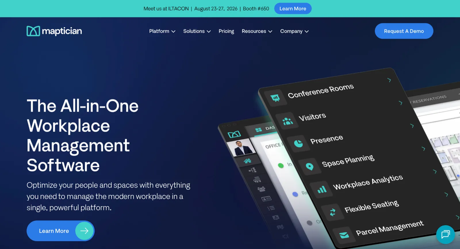
Maptician fits the professional-services firm, the law office or the bank that has to see who is in and where before it can plan anything. It unifies desk and room booking, presence, interactive floor plans, visitor management, and analytics on one platform, and builds presence from calendar sync, desk bookings, IP detection, and user input rather than a single source.
The reporting runs real-time and historical, with seat utilisation, cost per seat, and density ratios broken out by team, floor, and location, and one Am Law 200 firm took its Denver office live in three weeks.
Key features
- Utilisation analytics: report seat utilisation, cost per seat, and density by department, floor, and location for real estate calls.
- Presence visibility: see who is in and where in real time, built from calendar sync, desk bookings, IP detection, and check-in.
- Flexible seating models: dedicated, scheduled-flex, hoteling, and hot-desk seat types on the same map, all feeding the same data.
- Check-in and auto-release: confirm desk use through QR check-in and badge integration, which keeps the utilisation numbers honest.
Pros
- Central view of usage, room availability, and hybrid KPIs for policy reviews.
- Highlights gaps between scheduled and actual presence, exposing weak team-day compliance.
- Uses formats and language that fit law and professional-services firms.
Cons
- When people don't book or check in consistently, the analytics become less reliable.
- Detailed financial scenarios and "what-if" portfolio analyses still require spreadsheets or BI tools.
- Mobile analytics and integrations cover core needs but fall short for teams that expect a large, highly integrated enterprise stack.
Pricing
Maptician does not publish pricing publicly. It offers three plans: Starter, Professional, and Premium, which all include analytics and reporting as a core feature.
6. Gable: Best for distributed teams unifying booking and passive data
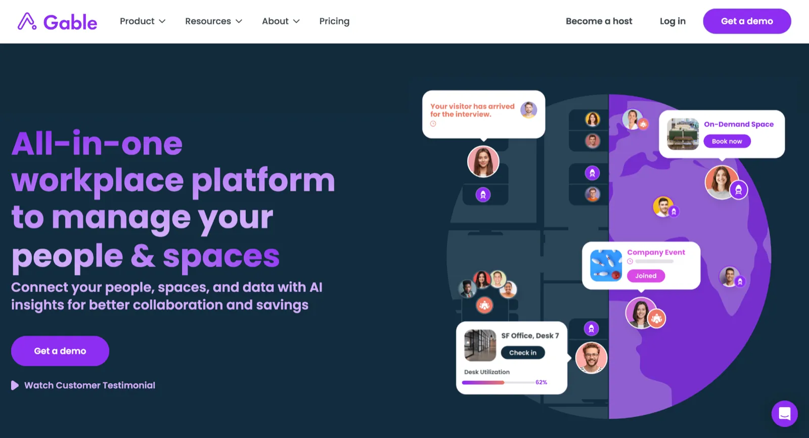
Gable suits the distributed company that wants passive presence signals and bookings living in the same report. It covers desk and room booking, visitor management, and parking, then layers a unified analytics engine on top that blends badge, WiFi, HRIS, and booking data into utilisation insights, with an AI copilot that answers utilisation questions in plain language. For a team spread across offices and coworking spaces, that consolidation into one reporting layer, at a per-seat price, is the pitch.
Key features
- Unified reporting layer: combine booking, badge, WiFi, and HRIS data into portfolio-level utilisation.
- AI copilot: ask utilisation and space questions through a chat interface.
- Consolidated booking: cover desks, rooms, visitors, and parking in one product with QR and NFC check-in.
- On-demand workspace access: book coworking and meeting space across a large external network with spend controls.
Pros
- One dashboard for offices and on-demand spaces, so distributed work isn't a blind spot.
- Pairs utilization with spend by team and location, helping justify cuts or expansion.
- Shows attendance and no-show patterns across flexible sites for keep/close decisions.
Cons
- The most detailed insights sit behind higher-tier plans.
- Focuses on overall use, not seat-by-seat sensor detail.
- CRE teams still need separate portfolio tools for full real-estate modeling.
Pricing
Gable's space usage analytics and utilisation reporting sit on its Enterprise tier, which is custom-priced.
7. VergeSense: Best for precise passive occupancy when hardware is funded
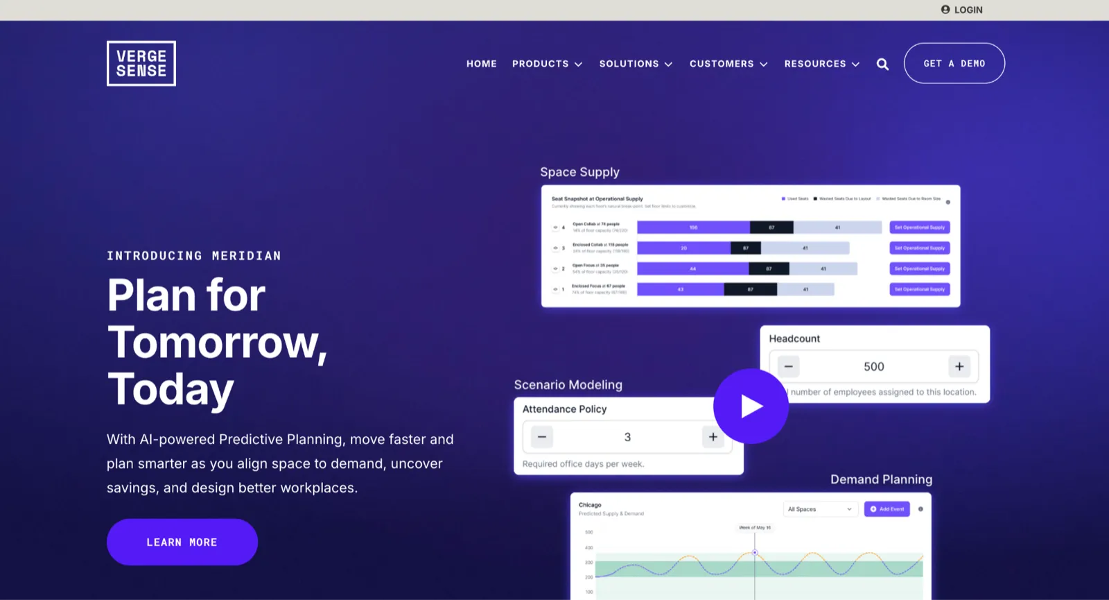
VergeSense is the choice when you need to know a chair was physically used, not merely reserved, and you have the budget to measure it properly. It reads occupancy from computer-vision area and entryway sensors, or from a building's existing WiFi, and captures people count along with active and passive usage, telling an occupied seat apart from one held by a laptop and bag.
The platform rolls that into portfolio-level trends, and a Workplace Assistant applies AI to occupancy, badge, and booking data to surface recommendations. This is spatial precision a booking tool cannot reach, and it arrives with an installation project.
Key features
- Area and entryway sensors: measure desk, room, and floor occupancy with high accuracy, with no personal data captured.
- Active and passive usage: tell an occupied seat from one held by belongings.
- WiFi option: read existing WiFi for area-level data without installing sensors.
- Workplace Assistant: apply AI across occupancy, badge, and booking data to recommend optimisations.
Pros
- Provides desk- and zone-level occupancy you can take into space plans and lease talks.
- Uses trends and predictive models to show where demand is shifting before problems grow.
- Has a track record of supporting consolidation and lease-avoidance decisions in large firms.
Cons
- Camera-based sensing demands privacy and compliance reviews during rollout.
- Hardware and integrations run as full projects, not quick configurations.
- Turning insights into new rules and layouts remains a team responsibility.
Pricing
VergeSense's pricing is custom. Deploy the sensors, and you pay for the hardware plus a platform subscription; start from your existing WiFi instead, and it's a software subscription alone. VergeSense puts the average sensor installation at under 90 days, while connecting existing WiFi data takes less than a week.
8. Density: Best for anonymous, enterprise-grade people counting

Density fits the enterprise that wants measured headcounts without a camera in the room. Its radar-based sensors count people with no lenses, cameras, or personal data, and feed real-time counts into analytics at the space, floor, building, and portfolio level, with heatmaps that replay how a space was used and predictive views of where usage is heading.
Auto room release frees ghosted meeting rooms when the sensors show no one is there. For a privacy-sensitive organisation that needs measured presence rather than booking intent, the radar approach removes the objection that usually stalls a sensor rollout.
Key features
- Radar people counting: report anonymous, real-time headcounts with no camera or personal data.
- Portfolio analytics: aggregate counts across spaces, floors, and buildings for real estate decisions.
- Heatmaps and predictive views: show how a space performs over time and where it is heading.
- Auto room release: free ghosted meeting rooms when sensors show no one present.
Pros
- Delivers anonymous, real-time people counts for each space.
- Measures rooms, floors, and open areas in a consistent way for portfolio comparison.
- Uses radar/depth sensing instead of cameras, easing privacy concerns.
Cons
- Hardware and cabling add project and budget overhead.
- Only covers occupancy; other workplace signals come from different systems.
- For small offices, sensor plus subscription costs can outweigh the benefit versus software-only tools.
Pricing
Density publishes its Waffle sensor pricing: $229 per unit, plus a software subscription from $2.50 per desk or $8 per room and phone booth each month, billed annually.
How we evaluated these workplace analytics tools
Every platform was assessed against these criteria:
- Data source and setup cost: does it read bookings, sensors, or both, and what does deployment take?
- Forward-looking or backward-looking: can it show planned attendance for the week ahead, or only what already happened?
- Resource coverage: desks and rooms only, or also lockers, parking, and access?
- Integrations: calendar, SSO, HRIS, and access control.
- Pricing model: per-user, per-resource, per-square-foot, or custom.
A tool can have rich dashboards and still fail because analytics only pay off when the underlying booking or sensor data reflects real use, and someone acts on it.
That is why setup effort and forward-looking reporting carry the most weight here.
Data source sits at the top of the list because each source answers a different question, and the numbers they return can sit far apart. In one three-month study by CBRE, occupancy sensors recorded an average daily peak utilisation of 59%. Access-control data for the same period put it at 85%, a 26-point gap. Working from the sensor figure, CBRE identified an opportunity to consolidate the space from eight floors to six.
The lesson for buyers is to match the data to the decision. A badge swipe confirms someone entered the building. A sensor confirms a space was occupied at a given moment. A booking shows who plans to come in and where they intend to sit, which is the signal you need to plan next week. No single method settles every question either: a 2025 review of occupancy-sensing research found that reported accuracy shifts with the type of building and the number of sensors deployed, and its authors note that combining sensor types can improve results.
So the useful test is which decision the data has to support, and whether the platform can take in a second source as your needs grow. That is why Awaio runs hardware-free by default and reads occupancy from sensors a building already has.
How to pick the best workplace analytics software
The right tool comes down to what you need from the data, whether that is planning next week, measuring exact occupancy, or finally getting reports your team opens.
- Choose Awaio if you want to right-size space and see who is coming in next week without installing any hardware. And you would rather run desks, rooms, lockers, and parking, plus any sensors you already have, from one platform.
- Choose VergeSense if you need proof a seat was physically used rather than only booked, and you have the budget to install sensors for that precision.
- Choose OfficeSpace if your real problem is dashboards nobody opens, and you want heatmaps and multi-source reporting across a large real estate portfolio.
Ready to see what your booking data reveals? Book an Awaio demo today.
Frequently asked questions
What is workplace analytics software?
Workplace analytics software collects the signals a building produces, bookings, check-ins, badge swipes, WiFi connections, and sensor readings, and turns them into reports on how space is used. Teams use it to right-size the footprint, plan hybrid attendance, and back real estate decisions with data instead of guesswork.
How is workplace analytics different from workforce analytics?
Workplace analytics measures the building: which desks, rooms, and floors get used, and when. Workforce analytics measures individuals: how people spend their time and how engaged they are. This guide covers space analytics only.
Can you measure office utilisation without sensors?
Yes. Booking-based platforms build utilisation from reservations, check-ins, and calendar data, which require no installed hardware. They show planned and booked use and can flag no-shows through required check-ins, though passive use of an unbooked space needs sensor or WiFi data.
Do you need hardware to get occupancy data?
Only for passive occupancy. Booking, badge, and WiFi data need no dedicated sensors. Sensors add seat-level precision and catch use with no booking behind it, at the cost of hardware, installation, and ongoing maintenance.